
Warm Neutral Kitchen Design Ideas
Posted by KraftMaid on 9th Dec 2022
Discover how incorporating warm neutral colors into your kitchen design can create an exceptionally inviting atmosphere that reflects your personal style.
Warm neutral colors have quickly become a favorite for kitchen design, offering the perfect balance of comfort, sophistication, and timeless appeal. The soothing tones of a warm neutral color palette create a welcoming atmosphere that feels effortlessly elegant. We’re sharing simple, inspiring ways to bring warm neutral colors into your kitchen design, making it easy to create a space that reflects who you are and feels as inviting as it looks.
WHAT ARE WARM NEUTRAL COLORS?
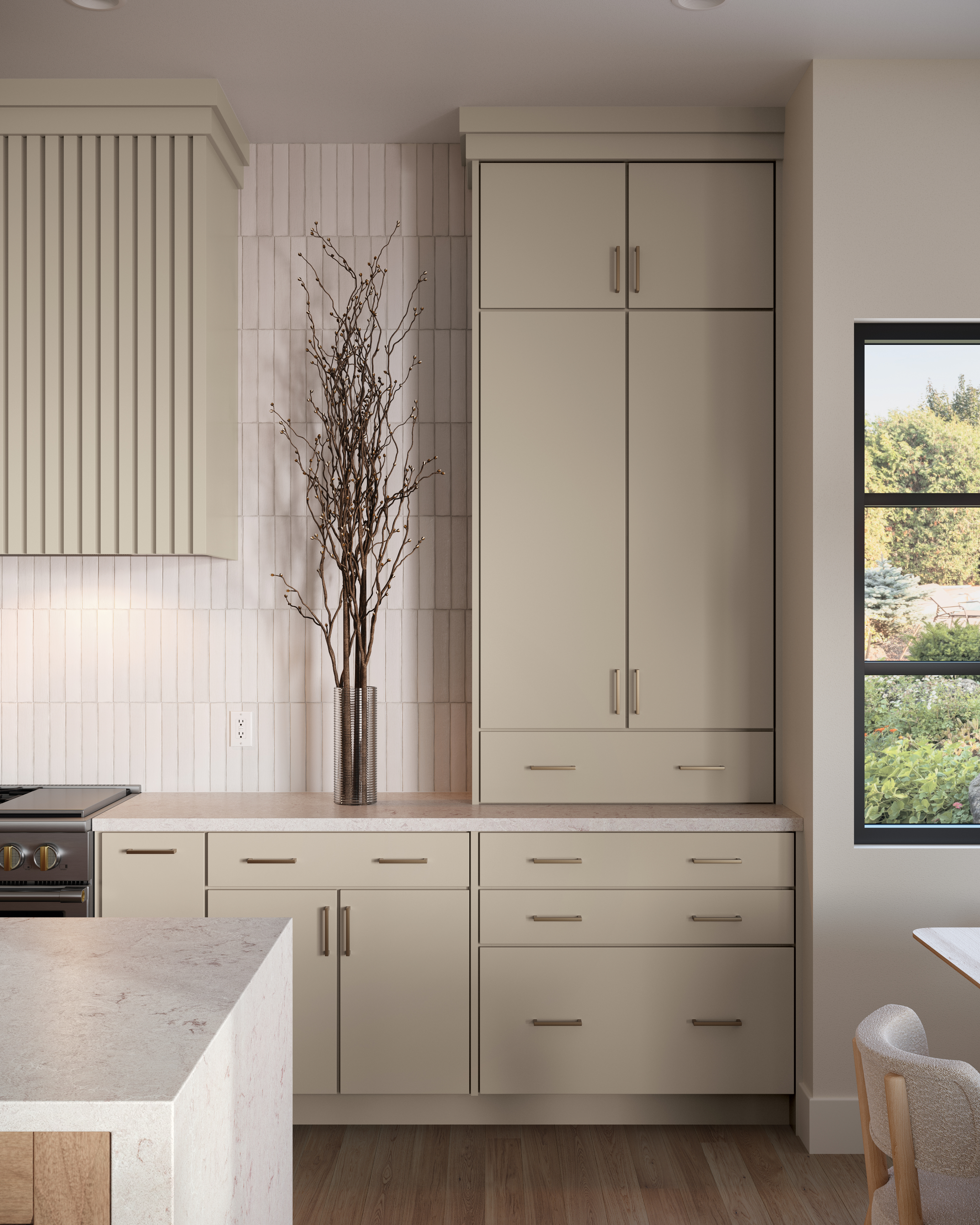
Warm-neutral kitchen cabinet paint colors blend the inviting warmth of earthy tones with the versatility of neutral shades, creating a balanced and timeless aesthetic. These colors typically include soft beiges, warm grays (greiges), creamy off-whites, and muted taupes, often infused with subtle undertones of brown, yellow, or red to add depth and warmth.
Unlike cool neutrals, which can feel stark or modern, warm neutrals create a cozy, welcoming atmosphere that pairs beautifully with a variety of design styles, from traditional to contemporary. Their adaptability allows them to complement both warm and cool accent colors, natural stained wood elements, and various countertop and backsplash materials, making them a popular choice for homeowners seeking a harmonious and inviting kitchen space.
Some of our most in-demand KraftMaid cabinets’ warm neutral paint colors include:
- Creamy shades of white – Warm White, Cottage, and Canvas
- Light- and mid-tone neutrals – Moonshine and Overcast


DESIGN VERSATILITY: SETTING THE STAGE FOR INFINITE STYLE
Warm neutral color palettes may be understated, but their true power lies in their versatility. Rather than making a bold statement on their own, they create the perfect foundation for endless design possibilities, seamlessly adapting to your personal style. Whether you're aiming for the clean simplicity of Scandinavian design, the warmth of a traditional cottage kitchen, or anything in between, warm neutral cabinet colors provide a timeless backdrop that is able to bring your vision to life.
Tonal Color Schemes:
Layering two or more warm neutral kitchen cabinet shades creates a cohesive, calming aesthetic that is subtly striking. This approach adds depth and warmth while remaining more visually engaging than a true monochrome kitchen.
Two-Tone Combinations:
Pairing a warm neutral cabinet color with a bold accent color is a striking way to add depth and personality to your kitchen. For a timeless yet modern look, consider a warm neutral like Warm White for your main cabinetry, complemented by a bold statement shade like Carbon for your kitchen island. This combination not only enhances the overall balance of the space but also creates a sense of visual intrigue, making your kitchen feel both inviting and dynamic.
Blending Warm Neutrals into Different Styles:
Use updated warm neutral cabinetry to refresh a traditional kitchen, creamier whites to soften the sleekness of contemporary designs, or warm grays to create a perfect backdrop for transitional spaces.


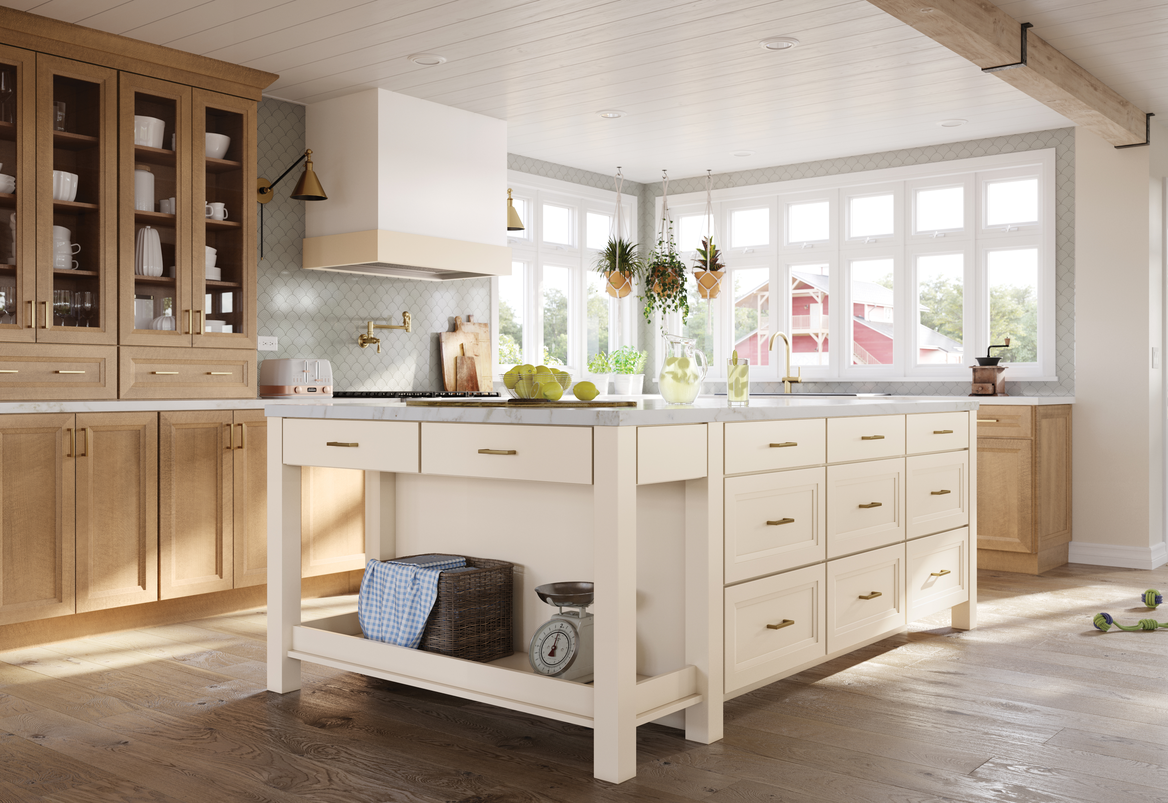
A COZY COMBINATION: WARM NEUTRAL PAINT AND NATURAL WOOD
One of the most compelling and popular kitchen design trends of 2025 embraces the harmonious blend of warm neutral painted cabinetry with natural wood stained cabinets. The intentional layering of this pairing brings visual depth and richness to kitchens while providing many avenues for personalization.
Designers are increasingly pairing soft neutral shades, like KraftMaid’s Warm White and Cottage, with stains like Wicker or Husk to create a space that feels effortlessly balanced. The warmth of natural wood cabinetry adds texture and character, while neutral cabinetry provides a soft, grounding element, resulting in a look that’s timeless, well-balanced, and full of warmth.

24%
chose contrasting colors for upper and lower cabinets in 2025.
Source: Houzz Kitchen Trends Study
The trend’s momentum is reflected in the 2025 U.S. Houzz Kitchen Trend Study. Nearly one in four of homeowners who are renovating their kitchens reported choosing contrasting colors for upper and lower cabinets. While white and warm off-white painted wood cabinets were the top choice for upper cabinets, wood tones – medium tone stains , especially – were the winner for lower cabinets.